Cate Triendl
4 min read
Avoid These 3 Common Guest WiFi Mistakes

Fact is, your customers’ digital experience is a critically important part of their in-venue experience. You’ve probably paid attention to the way your digital solutions (menu, order & pay, …) look from a customer’s point of view. You made sure the user interface is in line with your branding and easy to navigate for your customer. But what about your Guest WiFi sign-up? Are you making these common Guest WiFi mistakes?
Over the years we have come across a huge variety of good, bad and ugly Guest WiFi sign-ups in hospitality businesses. Well designed ones and also some not as attractive and user friendly as one would hope for.
Since we’ve been allowed back into restaurants and bars, we’ve gotten back into our old way of examining what’s out there and sharing it with the team.
Below are 3 anonymised examples, based on real Guest WiFi sign-ups and what needs improved on them.
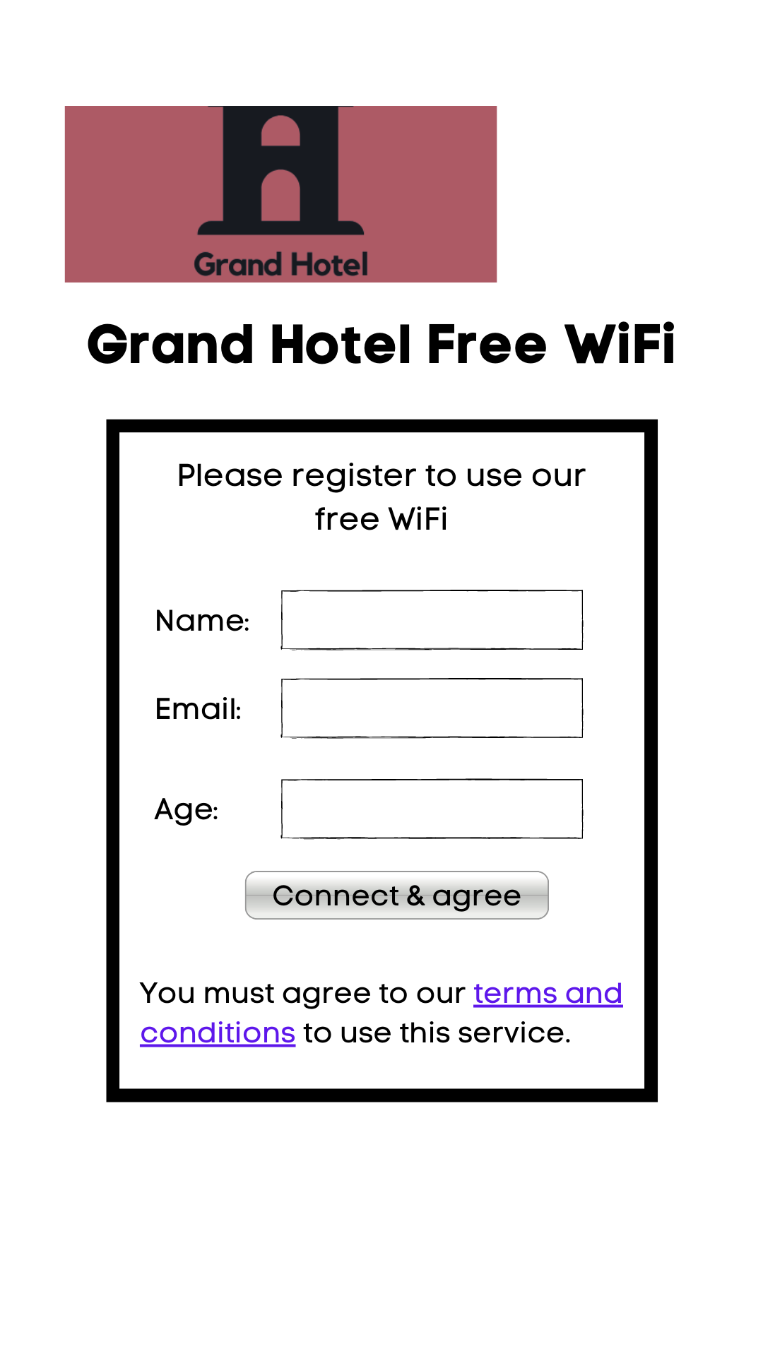
Case Number 1: Lacklustre design
Even though this sign-up has a logo, it’s not representing the brand very well. Always make sure to test your splash screen for both desktop and mobile to avoid parts of your logo or text being displayed awkwardly.
The overall look is quite plain and basic, which does reflect poorly on the brand. The bland button colour and its slightly off-centred alignment, as well as the missing background image contribute to a negative customer experience.
Also, watch for poorly chosen data fields. “age” in this case could be changed for “birthday” to provide data for birthday marketing campaigns.
This example also isn’t GDPR compliant as people can agree without having seen the terms first.
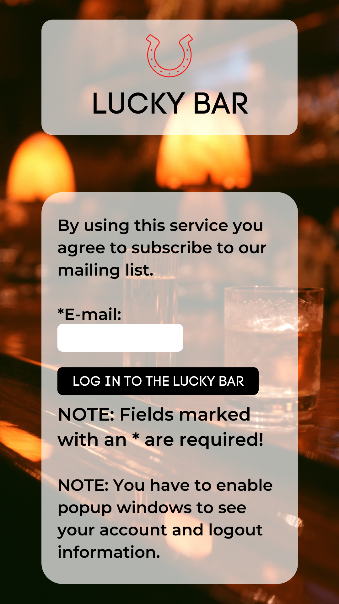
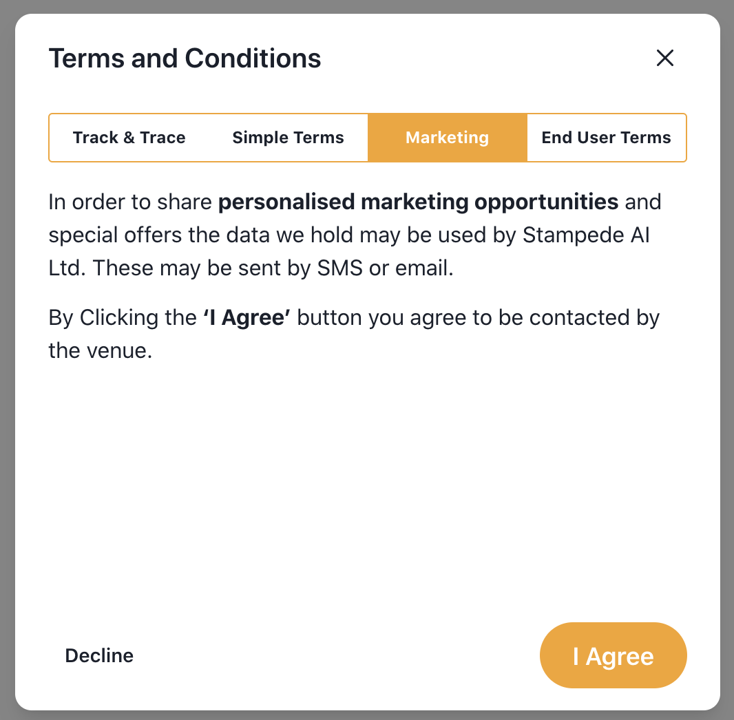
Case Number 2: GDPR fail
In this example, we wanted to focus on one important must-have part of your WiFi sign-up. The GDPR rules require by law that you give users access to your Terms & Conditions and offer them the opportunity to decline any data usage for e.g. marketing purposes.
Other than the legal issues here, the design is very text-heavy. Leave space for larger text by saying less. Keep it clean and try not to confuse people with technical details!
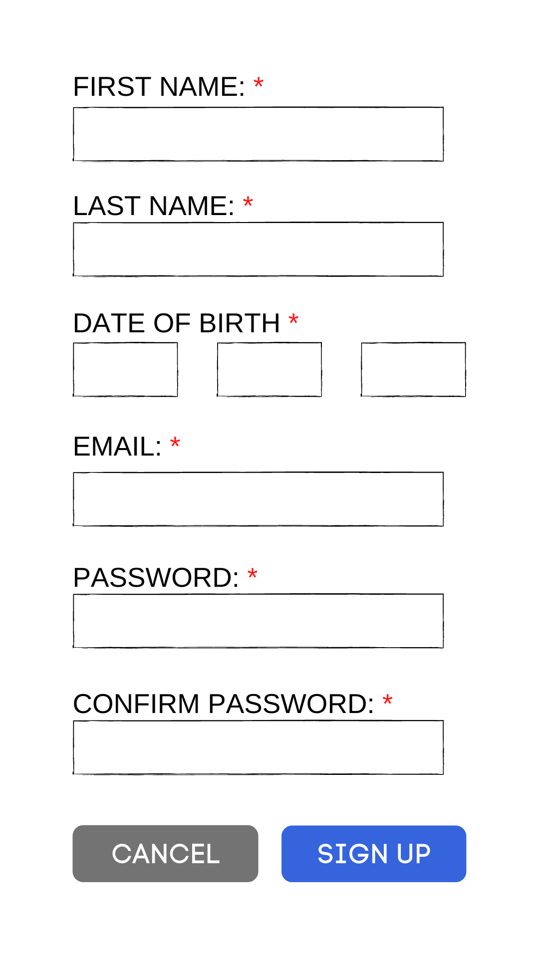
Case Number 3: Create a password?
Overall this splash screen looks pretty bland and branding is clearly missing, which we mentioned earlier.
The thing that catches your attention here is the fact that this sign-up asks for a password. It’s an odd thing to ask for when joining a guest WiFi network and might also keep them from signing up at all.
In this example we can’t see any password setting rules (number of characters, 1 number, 1 special character, etc.) but we all know how awful those are for many people. Avoid the problem altogether by avoiding the need for passwords.
So far, so good, but how can you avoid those Guest WiFi mistakes? How should the ideal WiFi sign-up look like?
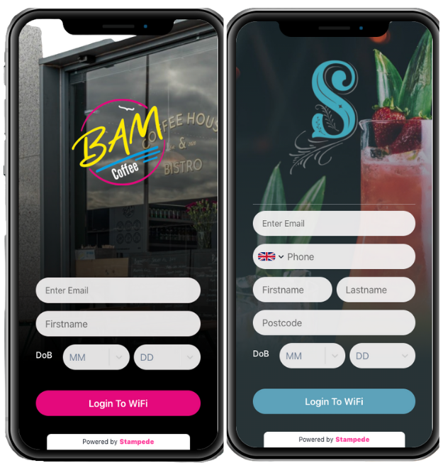
1. Branding & overall user experience
The first impression of these two examples is completely different compared to our previous ones. The navigation for the customer is straightforward.
The design looks appealing with consistent branding. Text size and alignment are neat and the CTA buttons are highlighted.
2. GDPR rules
In the examples above all GDPR rules are clearly stated before the login page appears and customers have a choice of accepting or declining.
If they decline, you can still provide them with WiFi access.
Final words of advice: Judge your WiFi login experience as if it was another page on your website. Would you be happy for it to represent your brand?
Our captive portal solution allows you to design awesome looking splash screens in just a few simple steps. Reach out to one of our team to get you started.